Monday, February 28, 2011

Some new lines....SEI and Bo Bunny...

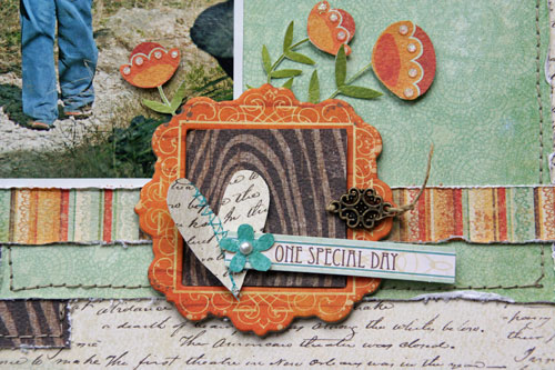
Wanted to share another layout I did with the Corrinne line from SEI!  This page is up on the blog, today!  The colors in this line are SOOO bright and cheery, you just HAVE to do pages about being outside!


I just LOVE this shade of kelly green in these papers!  YES, that is hand stitching around the outside...haven't done that in a LONG time!  :)


My other favorite thing are all the adorable die-cuts...there are SO many in the pack, and they all are double sided with different colors, so you can pick which side you like best!


I also got to play with some of the new BoBunny Ad Lib line, which I got from the owner of the LSS I work at to create some sample layouts with for when they carry the line.

This page I submitted for the final week of the Crowned Contest at Scrapdango.  You had to showcase a "talent" on your page, use and describe your style, and also use a go-to technique.

Charlotte LOVES pens...not crayons, not pencils...pens.  And she LOVES to doodle all day long!


I actually took some of her "doodles" and framed them in the little frames which I had cut out from some of the patterned papers.

My style almost always includes the following things on a page: thin black line outlining photos and elements, photos with white mats, stitching or other texture, dimension with pop dots or large items, a little dab of a bright contrasting color (in this page it's yellow) and a strong visual triangle using the "rule of three".


The technique I chose to use was fussy cutting. I cut out all the frame and their insides from patterned paper and a whole bunch of small circles from the patterned paper as well.


I really love how this page came out and can't wait to use more of these papers!

I'm SOOOO excited to have my first Clip It Up project to share with you on Wednesday!  Stay tuned!


Friday, February 25, 2011

Where is my little girl, Dancing Queen, and Say Cheese!

Let's see....so much going on!

So glad that Crate Paper is doing their monthly sketches again!  I have been in my scraproom organizing a lot lately, and decided I was going to use up some of my stash.  So I used some older lines to do this page about Charlotte.


All of a sudden, I have this little girl....and I used to have a BABY!  People always say it goes by so fast, but I had no idea.....


I loved the idea of journaling in between the strips on the sketch, so that is what I picked up on.  I really don't use a lot of flowers on layous, but i really liked this patterned paper. 


At Scrapdango, there was an ad inspiration challenge as part of the Crowned contest.  Here is the ad:


I used the ad in MANY ways for this page.


First, the idea of a "queen", ,or someone wearing a crown was what sparked me to use these photos, and hence the title.
I used the color palette and the design of the add with two same sized panels next to each other.


I also used the 4-pointed star shapes, and created my own journaling box the same shape as the text boxes in the ad.
Finally, I use the font and colors of the title to make the word "Queen" on my page (but oppisite colors).

And this last page was created for the Throwdown challenge at Memorable Seasons.  You had to use white space, doodling, a mask, and paint or mists.  LOVED this challenge!  I used my February Kit from YSS to make this page, and I LOVE LOVE it so much!


We went to the outlet mall last weekend, and I didn't get a thing for myself, mostly becuase I am pregnant and didn't want to buy any clothes, and I need shoes and accessories like I need a hole in the head, so I didn't get a thing.  But Miss Charlotte and Daddy made out good!  While we were sitting the the food court, I saw the photobooth and asked hubby PLEASE to sit down and take some pics...he HATES doing things like that in public.  This booth had a video screen on the outside and you could see what was going on "behind the curtain".  It was only $3 for 4 pics.  FINALLY he agreed to it, and it was the best $3 I ever spent at the outlet mall.  OK, maybe not, but it's close....


The pics themselves weren't great quality, but what do you expect for $3?  Plus, I think they are great anyways!!

Can't WAIT to go to Archiver's for the day tomorrow with my good friend HEATHER!  Expect lots of projects to be posted next week! 

Wednesday, February 23, 2011

Get Picky Sketch...

I'm on a roll...when I don't make my own sketches, I love to follow others!  And I just LOVED this sketch at Get Picky.  I already had these photos printed, so when I saw this sketch, I KNEW I had to use it!


These photos were from our trip in Novermber.  I had purchased the Crate Paper Restoration paper pack to scrap my favorite photos with from this trip, and I think this is only the 3rd page I have done....and I have TONS of photos that I want to use!


Anyway, I wanted to go with a different color palette, and the greys and greens of the papers are in the photos, and the yellow adds a nice contrast.  I layered a lot of the fun emebellies and used some Sassafras alphas and some other old yellow alphas I have had forever.  I am happy with the way this page came out!
TFL!

Tuesday, February 22, 2011

Sketchy Thursdays, Scrapdango, and YSS....

I lost my mojo in January, but I seem to have found it again!!!!! 

I used my Cocoa Daiy February kit (which hubby got me a subscription for for Xmas!) and this sketch from Sketchy Thursdays to make this first page.


For the background, I used a piece of cardboard (appropriate for a LO about a box) and some paint to stamp the lines.  I also used the fabulous bubble wrap stamp and some white ink to stamp the bubble wrap pattern (also appreopriate for a LO about a box!  :)  ). 


I used papers and stickers from Sassafrass and some artisan tapes from Pink Paislee.


I am still doing the Crowned competition at Scrapdango, and this is my week 3 layout:


We had to use lyrics from a list of songs for our title, hidden journaling, and two fonts in our journaling. 


I'm still playing with the MME papers and LOVE them!  I used some of the cute chipboard pieces for this page which add a lot of dimension!


Lastly, I am using up some of my Feb kit from Your Scrapbook Stash (YSS).  We went to Ikea around Thanksgiving time and had a great time shopping and eating swedish meatballs!   When I think of Ikea, I think of clean and simple lines, so that's how I approached this page: clean and simple!


I cut my title on my Cricut using just the Arial Bold font.  Stickers are Studio Calico and flowers are Sassafrass Lass.


Thanks for looking!

Monday, February 21, 2011

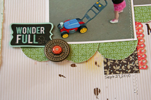
Mower to Love

I got to play with some bits of new releases from SEI for my projects this month.   The new Corrine line is my favorite!  You can check out HERE. I also got a paper pack of the White Elegance paper, which at first glance looks like you'd use it for wedding pics.  What is hard to see on the pics of this paper is that it has a shimmery finish to some of the designs, which I KNEW would resists ink and paints, so I have been playing with those on these papers, too!

I took these photos of Charlotte last September, when she would try to "mow" the street.  She just loves that mower, even though we ran out of bubbles long ago.


I really love the design of page and I think I am going to turn it into a sketch which I will draw up in photoshop.


I love the shade of green in this line, too.   I just did some simple strips of paper down the middle with some stitching, and cut some green circles from some of the patterned paper for the scallops.  The metal pieces are from the Claire collection.


I will have another SEI project to share next Monday, too!

Saturday, February 19, 2011

All Dressed Up! ST March GDT entry...

Well I finally did it!  I am trying out for a GDT spot at Sketchy Thursdays!!!  It was last minute for me to finish this, but I did it and I am glad I did!


Every time I look at this photo of Charlotte I totally crack up...she loves putting things on from my closet.

I used some more of the new MME papers from my LSS.  LOVE the doily stamp and I layered some of the different doilies stamped on different papers to make the big flower. 


This paper line also comes with new layered chipboard elements which are so FUN!!!  I love the dimension they give. 


My banner is some small pom poms layered with a triangle banner cut from patterned paper and then some of the chipboard elements on top.


Thanks for looking and if I make it into the top 5 PLEASE vote for me!!!!  THANKS!

Tuesday, February 15, 2011

I played with the new MME this weekend!!!!

I was SOOO excited that the owner of the new LSS where I work (Scrappn' Savvy), ordered the ENTIRE new MME release! She gave me some samples of the Gertie line before the new stuff arrived, and I used them for my first class today!

For this first page, I actually used a sketch from the MME blog:


I love to use grid and geometric shapes for background papers.  I was thinking I was going to use the lines for journaling, but instead added a journaling spot and added my title to the left of the photo.


It's hard to tell in these photos, but I used the doily stamps that came with this line to create the red flowers.  LOVE!!!!!!  I then used some of the new brads for the centers.  The only thing on this page that's NOT MME is the title, which is Adorn In and Glitz.


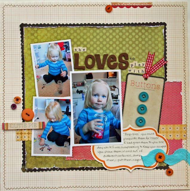
I also used a sketch for this 2nd page, too!!!  I really loved this week's sketch at Sketchy Thursdays.  I kept it pretty true to the sketch.


Charlotte loves to play with "Bop-bies" (buttons).  I gave them to her one day to keep her occupied while I was scrapping, and she played with them for hours, in and out of containers.  Now she points to my scrap room and says "BOPBIES, BOPBIES!!".  She has her own little bucket of things to play with now...


The buttons that go along with this line come on ADORABLE packaging, so I decided to use the packaging as part of my title!!  I just threaded some ribbon in the top of the package and added it right to my page. I added some other orange buttons from the Lush collection, too.

I always do a 2-pager in class as well, so this is one that I designed.  I wanted to go with a frame idea and used a piece of the die cut paper from the line as well as some of the die cut photo frames.


The background number paper I cut out in random squares, and I got the inspiration from Tessa at Scrapbook Circle with this page where she used some of the Basic Grey Hopscotch paper.  Charlotte playing with chalk reminded me of hopscotch, so that's why I used that paper!


All the people in my class tonight were my regulars and it was so good to see them all again and chat!  I really enjoy this job!  And I want to thank my dear friend Heather for coming to support me, even though she knows how to make her own gorgeous pages.  Thanks Heather!

I've got a lot of catching up to do this week!  More posts ahead...