Tuesday, August 30, 2011

The Ice Cream Truck!

At my parents cottage on the lake, there is an ice cream truck that goes up and down the road on the weekends.  You can hear "Turkey in the Straw" playing about a mile away!  It gets kind of annoying.  The funny thing is, the driver stops next door at our neighbor, who he is friends with, and will stop and have a beer....then continue down the road.

Most of these papers and the new "Fair Day" papers from SEI, with a few other lines thrown in there, too!


I machine stitched around the journaling and title circles with some teal thread to make them stand out more.

I actually broke out the decorative edge scissors for this white oval outlining the "sweet" sticker.

Sometimes you just need the perfect embellishment, but just don't have it in yoru stash, so why not make it?  I created this ice cream cone by copying the shape of the cone in the patterned paper.  I added some stickles and a button for a cherry!

Which reminds me that I posted a Paper-Piecing challenge this week at Memorable Seasons!  Go to the forum to check it out!


The first of the month is quickly approaching which means lots of reveals coming up!  :)

Monday, August 22, 2011

My first Glitz Designs reveal!!!!

Have I mentioned how excited I am to be designing for Glitz??  I raided my stash and gathered all my Glitz products together to mix and match some lines for these two pages that I created.

Little girls are so much fun.  I love to pick out clothes for Charlotte and do her hair.  Right now it is more for me than her!  :)

On this first page, I really want to play off of the blues and greens in my photos, so I used blue and green in my design with some splashes of yellow and orange.

I created a bow by folding some strips of paper and layering them together.  Then I added a tiny piece around the center.


This butterfly paper just begs to be fussy cut, so I had to do it!


I layered a lot of elements and did a little machine stitching here and there for some texture.


This next page I also wanted to focus on the bright colors from a bunch of different lines, so I printed my photos in black and white.  I did a simple grid design, and outlined each column with black machine stitching. 


I have to admit this page was more simple than a lot of my pages, but it still has some of my favorite elements like machine stitching, layering, distressing, and using a visual triangle of color.


Hope you liked my first Glitz reveals!!!!  Can't wait to start playing with the new stuff!

She's A Doll
Glitz Design Paper from Afternoon Muse, Laced with Grace, and Love Games
Glitz Design Cardstock Stickers: Laced with Grace
Glitz Design Peek-A-Boo's: Laced with Grace
Other: Alphas from Cosmo Cricket and American Crafts.

Expressions
Glitz Design Paper from Afternoon Muse, Laced with Grace, and Love Games, and Hoopla
Glitz Design Cardstock Stickers: Laced with Grace
Glitz Design Paper Layers: Laced with Grace
Other: alphas from Basic Grey

Friday, August 19, 2011

A page with no paper! A CIU project...


Well since I have arranged all of my favorite things on my Clip It Up, it’s time for me to start using them (cause let me tell ya, stuff is comin’ in faster than stuff is goin’ out!).  So I decided to really challenge myself on this one.  My challenge was to create a layout using ONLY things from my Clip It Up and a white piece of cardstock.  Yup, that’s right…no papers.  And since I wasn’t sure what I was going to be using, I decided on a photo that was black and white so that it would go with anything.

I started by going through my CIU and finding some things that I really liked, and some packages of things that were almost gone and that I wanted to get rid of.  So this is what I pulled off: (Note: I scrap at night, so it was hard for me to get good lighting on these photos!)


I went through each package and pulled out things that I wanted to use.  I started to notice that there were certain colors in the items I had chosen: blue, green, and purple…not a combo I usually use, but I liked it!  One of the items I pulled off was this old ephemera pack from Making Memories.  It has some small pieces of corrugated cardboard in there, so I decided to take those out and use them. 


I wanted to add a bit more color to the page since I wasn’t using patterned papers, so I painted the cardboard pieces using some paint daubers from Ranger (which I LOVE).  I also had pulled out some tiny chipboard pieces from Maya Road, so I painted a few of those as well.


Then came the arranging.  I spent a little time just pushing the elements around the page until I was happy with the balance and the placement.  And here is my finished layout!


I have to tell you that this honestly came much better than I thought it was going to!!!  I was so please with the result; I might challenge myself to do this again!

Thursday, August 18, 2011

Sketchy Thursdays-Grandma's Little Guy

It may look as if I have been doing a ton of things on my blog, but in all reality, most of these lastest posts were done before the baby came!!  Except for this one. I haven't done a sketch in a while cause I have been a little busy! As a matter of fact, this page took me about 2 weeks to do cause I can only get 10 minutes of time here and there! :) 

But I really loved this sketch, so I had to get it done.


I just loved these photos of my mom holding Kyler.  This was about a week after he was born.  My mom has treated both of my kids like they were her own, and dives right in to help out with newborns.  She was such a big help!


I was really drawn to the circles around the title and they reminded me of eyelets, so I decided to dive into my stash.  I can't tell you the last time I used eyelets on a page, but I really want to use them more (amd brads, too). 

This page is pretty simple for me, even though it took forever.  But I did use some of my regular techniques like distressing and stitching.

I have another post tomorrow, again a project I did a while ago, but I really love th idea behind it, so be sure to check back tomorrow!

Wednesday, August 17, 2011

I'm the Guest Designer at American Crafts this week!!!!!

Holy cow!!!!  I can't believe that I was asked to be a guest designer for American Crafts this week!  I am so so thrilled and honored to be able to work for such an amazing company!!  You can read my post on the AC blog HERE.  I would love for you to comment!

Expecting the baby late July or early August really limited our travel plans for the summer.  We had to find some creative, yet cool things to do to beat the Houston heat!!  So this page is about our summer “Staycation”. We go to The Little Gym and library weekly, and it helps that we have a pool in our backyard to help us stay cool!


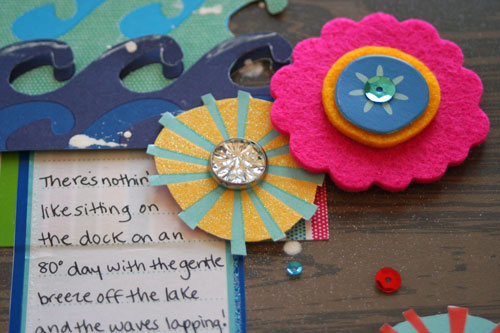
This photo was taken on the dock of my parents cottage in central New York.  The wood of the deck inspired me to use the woodgrain paper as my background.  I wanted to mimic the feel of small drops of water splashing from the waves, so I used some bits of white paint on the background.  There are also some tiny sequins scattered on the page from the “Delights” stickers.  I hand cut out the waves and added a 2nd layer that was popped up on top of the first.


Every summer we travel back “home” to central New York to enjoy the Finger Lakes and the St. Lawrence River.  I always do a page about our summer trip (which we took very early this year).  I printed a few small photos of some highlights of the trip and used them on this page.  I wanted to keep the design a bit more simple since the photos were smaller and had a lot of detail.  The Macaw Thickers were actually white, but I wanted a bit more colors, so I misted them with some spray mists.  


When I think of the Margarita collection and the Campy Trails collection, I think of vacation!  So I decided to make some simple, fun luggage tags that would be durable enough to withstand travel conditions.  I started with an 8x8” page protector, folded it in half and creased it.  Then I machine stitched on both sides of the crease, along the bottom, and up the side, leaving the top open as a pocket.  I then cut the page protector down the crease to create two, 4”x8” pockets (which I ended up trimming down) to about 4”x5” pockets).  I simply cut some patterned paper to fit inside the pocket and decorated one side with paper and phrases.  I did not add anything bulky because I wanted it to be flat.  On the back side of the paper I added a sticker where I can write my contact information.  I punched some holes in the page protector and threaded some ribbon through to tie it to the bag!  Wouldn’t this make a great, simple project to do with kids right before you go on vacation?  Or maybe you could customize a tag and give it as a gift to surprise someone with a trip!


The Campy Trails Just Write cards have some great phrases on them!  I used two of the same Just Write card and cut out the mountains on the 2nd one and popped them on top of the first card to give it dimension.  The chipboard tree border is also popped off a bit.  I had cut the little stars and added some glitter glue here and there for some sparkle.


When I saw the Cha-Cha paper, it reminded me of umbrellas at the beach.  I wanted to make them a bit 3-D, so I scored them and folded them to make them pleat and stand off the card a little.  I misted the sand and sky with spray inks, and used some toothpicks for the umbrella poles!  The beach towels are one of the barcode patterned paper strips.


I have been meaning to make a mini album of our trip from last fall for some time, and when I first saw the Campy Trails line, I knew it was perfect!  I used an acrylic and chipboard calendar kit with a stand for this album.  I painted the edges of the acrylic covers with a mossy green paint, and then inked with a brown Stazon ink.  I really wanted the photo of the brightly colored tree over the water to stand out, so I used it behind the acrylic.  The inside pages have a fairly simple format: each open set of pages is covered with patterned paper and I used a contrasting paper for a border on the left side, which I punched.  On some of the pages I used a chipboard border instead.  In between each set of pages I added a tag where I did my journaling on the back. The tabs on the bottom of each page were covered with some of the barcode patterned paper strips.


As always, I just love American Crafts stuff, and had a fantastic time creating these projects!  Maybe NEXT YEAR I can make the team!  :)

Thursday, August 11, 2011

I knew...

that it was going to be a boy!  Thats what that's what this page is all about!

I am a bit behind in my postings lately, as you can imagine, but I am finding bits of time here and there!  It's getting better!

This was LAST weeks Sketchy Thursdays sketch. I should be back on track for next week!  :)


My take on this sketch features so of the gorgeous papers from Authentique from the Blissful and Journey lines that I got from Memorable Seasons Online Store.  I LOVE the texture and thickness of this paper...it distresses well!


I did some misting with some spray ink and splattered a bit of yellow paint. And of course I had to add some machine stitching with some coordinating thread!


Love these tiny alphas!


This flower I made with some blue ribbons and raffia that came on some presents that Kyler got.  They were sitting on my desk and I wanted to use them somehow!  They match perfectly.


Well I hope to get to some more things that are laying on my desk.  Next week I have a HUGE post going up on Wednesday about an AMAZING GDT spot I have, plus a "paperless" layout I did for Clip It Up! (These are things I did BEFORE I had the baby!  :)  )