So I started first with the Crate Paper School Spirit papers, whose colors are perfect for fall! I arrange the photo on the "rays" page so that the center of the rays emulated from the center of my sweet little girl!
I cut out a frame, and rolled back the inside edges to expose the back side of the paper.
I cut some circles from another sheet of patterned paper to make the banner and the scalloped edge. Stitching completes the ensemble.
The second page I did was using the gorgeous Catching Fall papers by Lily Bee. I just love the patterns and the colors in these. When I saw them, I thought "farmhouse" , and so that thought inspired me on this LO.
I used part of the packaging from the Jillibean Soup corrugated shapes for my title area. I used a bunch of twine from my stash, and the dark brown burlap included with the kit.
Now these lovely little fringe flowers I learned from a tutorial HERE. This wonderful woman has SOOO many fantastic flower tutorials...go check them out!
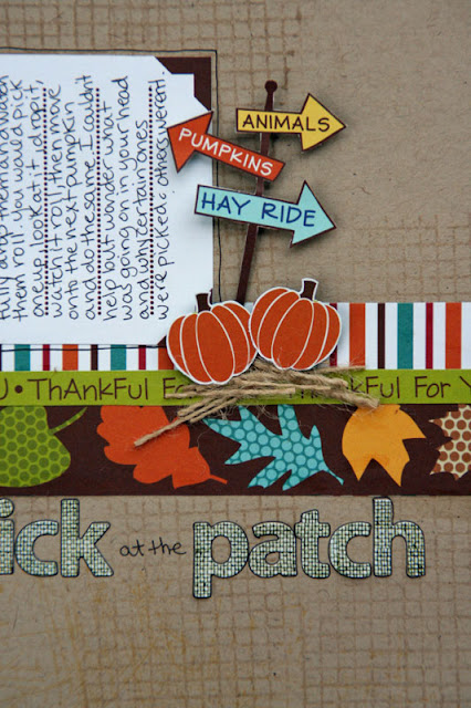
Next, I wanted to use some of the Bella Blvd. papers and make a more "fall" type of layout. I stamped my background with some different stamps and some light colored inks and distressed the edges of my cardstock. I fussy cut out all the little pieces from the papers.
For the scarecrow I used a popsicle stick (which I inked) behind him to stick him into the hay bale. To make the hay bale, I glued a piece of burlap to a rectanlge shaped piece of chipboard, and then frayed another piece and took a whole bunch of the strands to make it look like hay! I glued it all down with fabric glue.
Lastly, this is my favorite page, I think! (Although I said that about each one above as I was making it.)
When I have been working with kits the past few months, I have been tending to use the papers all from one manufacturer on a page and not mixing it up as much, which I miss. I mean, it is a lot easier to use everything from the same line because it coordinates, but I wanted to challenge myself to use a lot of the different lines together on a page and this is what I came up with!
My inspiration started with the Jillibean Soup "Nerd" journaling spot, and, well, I thought of my husband. I had these photos of us from the Renaissance Fest a few weeks ago. He hates when I try to take a photo of us while I am holding the camera, and he kept saying, OK, I'll smile, or I'm Ready, and I would go to click and he would purposfully look away. Jerk. I did get one good one in at the end.
Another fun fact about this layout. I never used a paper trimmer or a ruler for anything on this page. I cut all the strips by hand, and I know they are a little wonky, but that is the way I wanted it!
OK, so I have been SOOOO busy lately, as you can tell this week!! I hope to work on a few things next week to post, but we'll see!


2 comments:
These turned out great, of course! Love them!!!!!
ALL of these layouts are FANTASTIC! SBC is AWESOME!! Lisa does SO well with her kits, just makes it easy to play! :)
Post a Comment