Monday, May 30, 2011

A tour of my new Scrap Space!

Well as I mentioned a few weeks ago, I have had to give up my scraproom to make way for a new nursery for baby #2 who will be here sometime late July or early August (I hope!).  You can see a video of my old scrap space here. So I have moved my scrap space into our big family room upstairs, and I have to say that I really really like it! 

The whole moving process mad me have to purge a lot and get more organized.  My system pretty much stayed the same, but I added an additional shelving unit and bought some new nice containters and I feel great in this new space!

At each end of the room we have these little alcoves which are perfect for shelving and storage, so this is where the bulk of my stuff went.  I wanted to try to fit my desk in their, too, but it wasn't happening...too cramped.  I liek being able to have my Cricut and Big Shot out for east access.  I think I will use them a lot more now.


A close up of my papers and cardstock.  I had some Cropper Hopper vertical storage containers, but I got some other really nice ones from Ikea last wek and they hold a LOT plus they are sturdy.  I have to go back and label everything, but I know where everything is.


On the top shelf I have some odds n' ends, plus some small tote with embossing folders and dies in their.  The 2nd shelf down has bling, small alphas, brads, books, small stamps, and ink pads.

The shelves under the paper have ribbon, stamps, fabric, and other bits and pieces.

My punches are all stored on some rod and bins from Ikea.  I love having them out like this to see.  I also have a few jars of buttons and other embellies.

This is my desk space.  Above my desk I have tote with colored alphas, b&w alphas, and a bin of stickers and stuff.  Then there are some tin drawers with flowers sorted by color, and other containers of small brads and eyelets and bits,


The rolling cart to the right of my desk has tons of chipboard and mini albums that need to be used!  My Clip It Up holds some of my favorite embellishments.

The big black storage container to the bottom right of my desk hold all my current kits and design team kits and/or papers.  These are what I use most.  To the left are trays for scraps and my garbage can!
Well that is pretty much it!  I love being in this space because Charlotte can play and hubby can watch TV!  :)  Oh, and just to give you an idea...although my scrap space reaped teh benefits of organization, this is what the rest of the room looked like while I was arranging and taking pictures!  :)  Do you see Charlotte behind my chair? Yes, it is a disaster, but it will all be cleaned once we start putting things in the new baby's room!


Well I hope you enjoyed this!  Glad I got to share it with you! 


Thursday, May 26, 2011

Sketchy Thursdays Reveal!

I am excited to share my Sketchy Thursdays page with you this week, like always!  Here is the wonderful sketch!


I used some Crate Paper Toy Box papers and some October Afternoon 5 & Dime papers for this page.


This was a bit of a hard sketch for me at first because I didn't know what photos I wanted to use.  I had these photos already printed, but they were 3x4's.  Once I trimmed off some of the excess white space of the photos, I was so much happier with how they worked on the page.

Charlotte can't say "jump" yet, and instead always says "bump"....it is too cute...:)

Be sure to join in this week at Sketchy Thursdays for your chance to win the weekly prize!!

Wednesday, May 25, 2011

Clip It Up Projects, bad habits, and one Cocoa Daisy...

Last month I recieved some goods from Clip It Up and their sponsors.  We have a special project going on a CIU that I can't quite tell you about yet, but I AM able to share with you some of the pages that I created with the sponsors!  PLEASE stop by the CIU blog today and check out my post!

This first page I shared last week and was based on a Page Maps sketch.  I used some my Little Shoebox and Nikki Silvils papers that were sent to me.  Luckily, we've had a few celebrations around here lately, so these papers fit perfectly!


Then I created this page with the Little Yellow Bicycle "Cupcake Love" collection, which is just so bright and fun and pretty!  And there are TONS of embellies!  I used a Page Maps sketch for this one, too, and I also based it on a challenge at Cocoa Daisy for the crop two weekends ago.


Love all the little things that come with this line. I actually used some of the crepe paper from Charlotte's Bday for this page, too! And just for a tease, I have another HUGE project to share very soon using these same products.


I will leave you with one last page that I did for the Cocoa Daisy crop (not with papers from CIU, but with the May Cocoa Daisy kit and some things from my stash)!   The challenge for this page was to use something related to books, at least 5 layers of papers, and a typewriter font.


We went to the library for the first time a few weeks ago, and these were Charlotte's first library books.  She LOVED Toddler Time at the Library, and she really loved these books!  I hated having to take them back to the library because I don't think she quite understood that they weren't hers!  :)

I used some other papers and embellies from the Crate Paper Toy Box line and a few odds n' ends from the Cocoa Daisy kit.


Monday, May 23, 2011

A few SEI pages...

I wanted to share with you today two pages that I have done for SEI this month.

This first page uses the Corrine line with it's bright and cheery summery colors!


Back in March one day, we went to the park and were excited to try and fly a kite with Charlotte for the first time.  When we got there, I knew there wasn't enough wind, but hubby insisted that we try.  Well we looked like idiots rnning around the field trying to get the stupid thing up, trying different stratagies and turning the kite this way and that.  Charlotte was just running around, and was having a good time at least!  :)

I misted the background of my page slightly and on the right side I cut the center piece of paper to fit the shape of kite tail.  I added a cluster of embellies and buttons to balance out the colors on the page.


I wanted to make my title a bit longer, but didn't want to use all the same letter stickers, so I printed part of it out, which I have never really.  But I love that typewriter font and will definetly use it again!


This next page was an attempt to get as many photos on a double page as I could about our trip to the arboretum when my mom and dad visisited in March.  I loved the greens in the photos, so I used the soft greens and purples and greys in the Couture line for this page.


As you can see, I did a TON of handmade flowers and added a lot of little elements to each grouping of flowers.

I would love for you to visit the SEI blog today and leave a comment!  Thanks for visiting friends!!

Saturday, May 21, 2011

SIX layouts from the Cocoa Daisy Crop (so far)....

Last weekend was the online crop at Cocoa Daisy and they are always my most favorite crops to do!!!  The inspiration and the challenges are just amazing!!!!  The crop entries are due tomorrow night, and I have two more in progress, but then I'm DONE!  :)

So far I have done SIX pages this week, which is a lot for me, I think!  I am excited to share them with you!  I'm just gonna give some brief info cause there are so many...

Thie first one was for a ONE HOUR challenge, which stress me out so much.  I did go back afterwards and add a few things in.  I have had these photos to scrap for a while and I am actually really please how my page came out in an hour!  :)


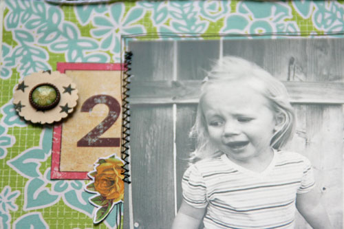
This next page is one of my favorites!  I took this photo about a month ago.  I was trying to get a good photo for my "Almost Two" page which I did a couple weeks ago.  Charlotte was gettin' a bit cranky when I snapped this and all I could think about were the Terrible Twos that were about to start....
The design of this page was from a scraplift at My Scraps & More, which is another great site that is having an online crop THIS weekend!

I used the Cocoa Daisy May kit.  The challenge was to use a black brackground....suitable for such a "dark" topic, don'tcha think?


This next page was for a sketch challenge.  I had a few sheets of this BG hopscotch paper and over our Easter trip, the girls all got chalk in their Easter Baskets, so we went out to draw and play hopscotch.  I know this sounds silly, but we didn't really know how to play!!!  We knew how to draw the numbers and that you had to throw a rock, but that was it!  So it last all of about 5 minutes, if that....

I used some square chipboard pieces and covered them with some papers and stiched a hopscotch grid pattern in black.


This next page is something really different for me.  We had to use some album covers as inspiration, and there was one with a silihouette of a girl and some birds.  It reminded me of this photo of us at the beach.  I stamped and misted the heck out of my background...it's a little too much for me, but I went with it anyways.  I cut the birds with my cricut.  This isn't my favorite layout, but it is what it is, and I like the memory of walking on the beach that night....


During the crop, there was a challenge posted about staining some bits with coffee and doing a page about someone you would/do enjoy having coffee with.  As I was reading the challenge, Charlotte was sitting on my lap drinking her milk, and I was having coffee.  I wanted to write the story of our morning "Boffee" and how she likes to steal some sips from momma's cup, and we giggle like we are breaking some big rules...:)  I actually took this photo at that moment, too!

I used coffee stained coffee filters for te larger circles, and then used one and rolled it into a flower and painted it.


Lastly (for now!) is this page that was inspired by some color and patterns of some fabrics. I really loved the green, pink, yellow and red combo.  The little red starbursts were inspired by some floral prints on the fabrics.  The green reminded me of Charlotte's BESTEST BESTEST friend, Froggie, so I did a little photo shoot with her and her friends!  :)


Holy crap that's a lot of layouts!!!!!   Thanks for looking today and hope you enjoyed!!

Thursday, May 19, 2011

Sketchy Thursdays reveal and some Echo Park papers!

I am so in love with this week's sketch at Sketchy Thursdays, and I was SOOO happy to see it!


I have had these circle coasters sitting on my desk waiting to be put on a page about a special dinner that hubby and I went out for.  Them are from a Brazilian steakhouse restaurant called Fogo De Chao. 

The have 15 different kinds of meats that they roast on spits.  When you want to try some meat, your turn your card to the "green" side and the waiters will rush to your table with the entire skewer and slice the meat right onto your plate!!!!!  It was so funny becaue as soon as you turn your card, all these waiters start running to your table.  Keith was trying to be funny and would flip the card, then flip it back to the red side quickly to trick the staff.  It was funny the first time, but not the next 10 times. 

Anyway, we had a great dinner because it was a special "Thank You" from his work for his accomplishments, and it was on them.  So of course even though we were completely stuffed, we ordered dessert, too!  :)

I used some fo the gorgeous Echo Park For the Record papers and stickers.  I thought the colors and some of the cards fit the page perfectly! I used the border strip page from the collection, and instead of separating the strips, I just cut out a whole chuck and used them just as they were.  I machine stitched between each strip and around the outside edge.


Since my journaling was so long, I decided to mount my photos so that they would open and expose the writing beneath.  I simply added some more length to the photo mats and creased it so that they would open.  The middle photo is glued to the top photo so they both open together.  I loved this little trick and will definetly use it again on other pages!!!


Here is another page I did using the Playground line from Echo Park. Believe it or not, I didn't use any of the patterned papers from this line!  I just used the sticker sheet, the border strip sheet, and the elements sheet!!  I also used my Sew Easy tool and did some hand stitching around the edge.


I saw this idea of using a banner pennant as the base for an ice cream cone in a magazine, so I wanted to use that idea on my page about ICE CREAM!   The ice cream itself is actually a journaling block from the elements sheet of paper.  I thought it looked exactly like a big hunk of vanilla.

Whenever I use stickers on my page, I always mount them to cardstock first and then cut them out.  That way, I can arrange them on my page to see where I like them best!  And then I can use pop dots to pop them up if I want!

TFL today!!!