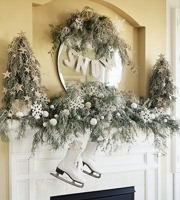
For my Glitz pages this month, I am going to share a double pager and my take on this months inspiration piece. This is the photo that we were to draw some inspiration from for a layout or project.
I loved the soft green color of the evergreens and the bright white stars, so I used them on my page. There is a tinge of silver on some of the evergreen branches in the photo, so I used some silver paint and splattered it on the background.
There is a bit of dark blue tulle under the photo and the circle shape in the inspiration piece inspired me to stitch a circle frame around my photo.
I found a cutting file online that I used to cut the evergreen branches. I misted the paper with a bit of green mist to give it a bit of contrast aginst the background.
I then cut a few stars and scattered the on the page, and hung my title on some twine much like how the word "snow" was hung in the inspiration photo.
For this next page, I really wanted to use a lot of pink to showcase the girly theme of my page! My little girl is really into putting on makeup like mommy does (and she calls it "gump gump"). I had so many photos of this particular makeup incident that I had to do a two pager.
I used two different papers for the background but connected them using the houndstooth print. The girly flowers, prints, and phrases all fit together so perfectly.
Thanks for joining me this month!
Supplies:
Twinkle
Dance in the Sunshine "Floral" paper
Dance in the Sunshine "Raindrops" paper
Vintage Blue "Motif" paper
Vintage Blue Trims
Vintage Blue Glitzers
Other: Paint, Ranger; Wood Alphas, Studio Calico; Software, Craft Edge and svgCuts.
Put Gump Gump On
Beautiful Dreamer "Damask" paper
Beautiful Dreamer "Polka" paper
Beautiful Dreamer "Houndstooth" paper
Beautiful Dreamer "Stripe" paper
Beautiful Dreamer Whatnots
Beautiful Dreamer Title Stickers
Beautiful Dreamer Epoxy Stickers
Beautiful Dreamer Peek A Boos
Teeny Alpha White Type
Subscribe to:
Post Comments (Atom)


5 comments:
SERIOUSLY beautiful layouts Audrey!
Oh Audrey - these are both gorgeous but my favorite is the Evergreen one - Siiigggghhh. Wonderful!
Your layouts are both so beautiful. Love how you hung the title as a banner on the first one and all the layers of pink on the 2nd layout are so fun!
Wow, love these!! That first one is amazing!! Fabulous take on the inspiration image!!!
Love both of those layouts! The photo of your son is amazing!!!
Post a Comment