Here's a bit of what I wrote about our challenge this month:
" I take a lot of photos. Right now, I have been using 2 or 3 smaller
photos on my layouts. But truth is, I
have a lot of events where I would like to include a lot of photos on a larger
spread so that you can see the details in the photos to. So I print out the photos with the intention
of putting them on a 2-page spread...
I just can’t get it. I feel like I have a certain style, yet when
I sit down to create a 2 pager, it feels nothing like “me”.
SOOOO, your next challenge is to create a
double page layout. And I don’t mean
just any double page. I want you to
really think about your style and your design practices for single pagers (the
first assignment helped us define our style, so think about those
elements). Then take those ideas and try
to apply them to a double pager.
Here
are some ideas:
*Start by thinking of your canvas as a
12x24” size. Before you even print
photos or pick papers, try to envision (or sketch out) a design that feels like
“you”.
*Once you have a basic design, think about
the techniques that you love and where/how you will incorporate them on your
page.
*Choose products that you would use for a
single page layout. If you use white
cardstock as a base a lot of times, then use it on your double page. If you mostly use patterned paper, then use
that. And if you don’t have 2 of the
same sheets of patterned paper for your background, I REALLY challenge you to
use 2 different 12x12 sheets for the base of your spread! (Kim Watson does a superb job of using 2
different sheets for her backgrounds…if you have CK magazine, look at some of
her pages.) http://kj-starre.blogspot.com/
*Another way to approach this, (which I
personally want to experiment with more), is to create 2 single pagers, but use
the same papers in the same ratios. The
papers and the photos will help tie your design together.
You might do this challenge and not be
happy with your first result, so I challenge you to KEEP TRYING! Do a 2nd , double page layout and
try to learn from your “mistakes” on the first one.
Also, if you typically DO create 2 pagers,
then apply the same ideas to a single page spread instead.
As we create this month, if you have
thoughts about your process or are struggling, OR you are loving what you are
creating, share some of your ideas with us!!!
I can’t wait to see what you create!"
I hope you will stop by and see what the designers on this adventure have created:
OK, so lemme start by saying I have REALLY been trying to do more double pages. In this post, I am going to share with you the page I specifically did for this challenge, and a few other double pagers I have done over the course of few months.
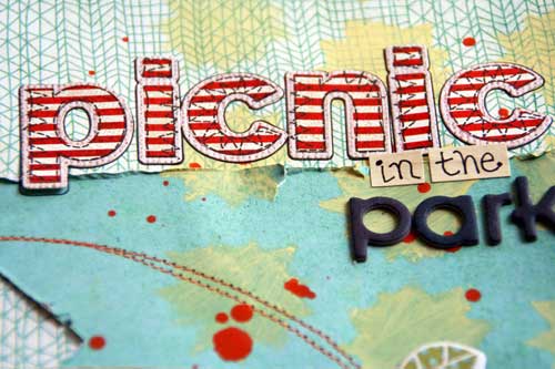
So here is the page that I specifically designed for this challenge. I decided to choose two different background papers and try to stick to elements that you would see on my single page layouts such as titled photos, machine stitching, misting/masking/painting, and a visual triangle. I used the PB&J line from Basic Grey which is one of my favorite lines this summer (although these photos are from a day in February). (Click on the photo to see details more clearly)

I used an old negative scrap paper from some suns I had die cut on my cricut to paint some light yellow sun bursts in the background. I splattered some orange paint and machine stitched some circles in orange thread.
I layered a few patterned papers under each cluster of photos and added a few accent stickers here and there.
The flowers I made myself and actually tried to copy the design of some of the flowers on one of the patterned papers. They came out just as I hoped.
This isn't my favorite layout of all time, but it is growing on me. I really like the right side alone, and the left side is just a bit too much for me. BUT I love that I got this page done. It really was a challenge for me and I worked on it a long time.
Speaking of a long time. I started the next page in November of last year (this is the Crate Paper Peppermint line, which was their Christmas line). I wanted to try and use Christmas papers for something other than a Christmas page. I had gotten the basics of the page done, but I just finished it up the other day AFTER I did the page above. I think I like this page better than the first...
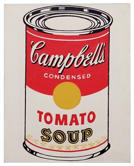
My inspiration can from a can of Campbell's Soup.
I used the white and red combo, and I stamped some circle shapes on some gold paper to mimic the seal on the can. I also used their famous slogan for part of my title. I hand-wrote the M's and then punched holes and hand stitched them.
And aren't these letters perfect to match the word Soup on the can??
I played around with my circles and stars stencil and stamp set again....
I REALLY like this page. It still has elements of me, but it is a simpler design.
This next page I did back in March. I didn't post it because I was waiting on the die cuts from the Crate Paper Story Teller line to add as some accents to my page.
This is Kyler and his first girlfriend. Aren't they adorable??? I love this series of photos.
This page really feels like me. I love the skewed photos, the paper layers, the paint splatters, and there is even some machine stitching in red thread along the edges. I also LOVE this collection of papers.
*In these detail shots, I added in a few more elements to the page.
This page I recently did for a misting class I taught at my LSS. I used the Studio Calico Take Note collection. I used two different background papers, but misted in coordinating colors to tie the pages together.
I misted the sun yellow, used a mask to make the blue and white clouds, and then used some die cut letters and misted over them for my title, too.
Lastly, a page I also started a few months back, but just got around to finishing, too. On this page I took a different approach and used the same papers and a similar design, but I actually created each page seperatly. I combined them by matting them both with a black border and did some misting of white ink over the seams.
I was thinking of all things bowling while doing this page. I used a woodgrain paper to represent the bowling lanes. The blazonry stencil looked kinda like bowling pins, so I misted with white and then stitched a red line or thread across the top of each row to make it look like the red stripe on the pins. I decided to go with circles because of splatters on the carpet in the photos with the bowling shoes. OH, and the little tiny chipboard squares???? FRAMES? Like in bowling...get it????
Not sure how I feel about this page. First of all, the photos aren't that great because the lighting was so terrible in there. I probably should have used some lighter paper colors. And there are a LOT of photos. I am not sure if the design works or not.
BUT GUESS WHAT? I have all these memories SCRAPPED and that's what matters!!!
What I have learned:
1. My favorite pages are the ones with the photos in a line.
2. Double pagers take me twice as long as single pagers.
3. If the photos are busy, I need to tone down the papers and embellies so that the details of the photos can stand out more.
4. I am going to continue to develop my double page making skills, BUT I think that single pagers are still my favorite for now!
Thank you SOOO much for stopping by today. I know this was a HUGE post, but I hope you found something inspirational in it!!!


13 comments:
wow, Audrey, you were so productive. Loving that your photos are not layed out in grids, it is so much more inviting this way. Your sweet embellies are just perfect!
Wow, wow, wow!!! You are amazing, love them all!
I love these! I find it interesting that most of the LOs that I see "out there" are 1 pagers. I would much rather do a two pager. Clearly, I am in the minority. It's been challenge for me because I don't see very many out there to learn from! Thank you for these!!
I really love the layout you did for our challenge!! The strips of paper crossing the two pages and elements on both pages made for a nice cohesive look!! Thanks for a great challenge!
These are all so awesome...love them all! Incredible work! You never cease to amaze me!
These are all so amazing! I am double page challenged myself - lol!
Audrey! I am amazed at how prolific you are! I really your challenge design but my fab is your soup can inspired one. I like that you shared with me what you learned! I love that you are so inspiring EVERY TIME!!
Wow Audrey! You have totally rocked the double-page challenge!! Thanks for sharing your amazing talent :)
Joanne xo
WOW totally FABULOUS!
wonderful...especially love the how to water flowers.
Wow, your layouts are wonderful and reading about your process is a great learning experience for us, too! Thanks for the truly challenging challenge!
- Ann Jobes
www.lovestnpaper.com
Awesome two pager inspiration Audrey! I really like them all - picnic in the park and bowled over are my favs of the bunch - lots of fun elements on all your pages. Thanks for the challenge!
Oh My Heck - you make it look so easy!! I STRUGGLED with my one measly little 2 pager! :) Thanks for the challenge - I love my layout!
Post a Comment