Wednesday, August 29, 2012

Jump on In! GCD Studios

We have been having an extra busy summer this year, traveling to a lot of lakes and cottages, and seeing lots of family and friends.  I know, sounds just awful, right?  :)

My daughter is becoming more and more fearless of the water, which is good and bad at the same time. I had my brother snaps these photos of her on my "action/sports" setting as she was jumping off the dock into the water. I focused on using lots of blues and yellow from GCD Studios collections...


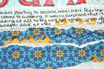
I wanted to mimic the setting on my page, so I created some "waves" with the navy strips that I tore along the top edge to give it a white edge.  I like the yellow accents, so I did a few tiny punched waves and then machine stitched a wavy line with navy thread.


The clouds matched the background paper perfectly in color, and I love how the different pattern on them makes them stand out just enough from the background.  The sun I created with a sun-shaped punch, and then punched it out again with a larger circle punch.  I then backed it with yellow patterned paper using pop dots.

Summer is starting to wind down and before you know it, Labor Day weekend will be here!!  Hope your last few days are filled with lots of sunshine and good times!

Supplies:
Papers by GCD Studios-
Flower Child "Hippie Plaid" #1643
Flower Child "Flowery" #1641
Flower Child "Wandering Geo" #1638
Flower Child "Layered Geo" #1644
Flower Child "Twisted Floral" #1649
Oh Happy Day "Chloe" #1766
Oh Happy Day "Amber's Avenue" #1774
Other-Mists-Studio Calico and Tattered Angels


Audrey Yeager GCD Studios DT, 2012 GCD Studios Layout Gal

Monday, August 27, 2012

Crate Paper challenge-patterns, and some news!

I love doing Crate Paper's monthly challenges.  I haven't done one in a while with our move going on, but when I saw the one this month to use papers to create patterns, it was right up my alley!  I love taking inspiration from quilts, and that is how I came up with the design for this page below.


I took a whole bunch of different papers from 4 collections: Pretty Party, Storyteller, Little Boy Blue, and Portrait.  I cut squares in quarter inch increments from 2" to 1 " (giving me 5 different sized squares).  I layered the squares in the corner and stitched down the middle. Then I distressed the edges with my fingers a bit.


 On the background, I used a circle stencil with some white paint, and then I just used my black pen on the woodgrain stencil to make some  waves.


I layered some stickers and called it done.  Then I smudged my journaling!  I hate when that happens!!!!  Oh well, at least you can still read it.


In other news, I am SO excited to announce that I made the My Scraps & More design team!!!  This online store has THE BEST shipping around...seriously.  And Tammi always has great deals on new lines, PLUS there is a giveaway every Monday on the My Scraps blog!!!  And you should see who else is on the new team!

Thursday, August 23, 2012

Catching up with a sketch...July 4th w/BG

I don't know about you, but I have a PILE of summer photos that have yet to be scrapped, and still that many and more that even need to be printed!  It has been a whirlwind of a summer for me.  For my readers who don't know, we just moved from Houston to central NY a few weeks ago.  The good news is we are now super close to my family...as a matter of fact, we are livin' with the 'rents til we find a house.  The bad news is, well, we are livin' with the 'rents.....

Anyways, I am trying to dig into this pile of photos, and one of the quickest ways to do that, I think, is with a sketch!  Here is my layout with one of my most favorite collections from this summer: Basic Grey PB&J.


It is based on this sketch by Kristine Davidson:


Yes, it is a lose interpretation.  When I start with a sketch, my page tends to go off the beaten path a bit, but I think it is still recognizable.

Anyways, let me talk about the layers that I have on this page.

I started by stamping the black doodle circles with black ink, and then layered the white doodled star stamp with white ink.  I added my papers and strips and then splattered some paint.


I added my embellie cluster of the circle journaling spot and the chipboard banner, and then scattered some small confetti circles around the page.  I finished with a bit of stitching here and there, and some wood veneer stars from Studio Calico.


Lately I have been analyzing my pages a bit, especially the order in which I layer things, and trying to mix up the layers a bit more.  You will see this in my layouts over the next couple of weeks!  Thanks for stopping by today!

Tuesday, August 21, 2012

The last of the August SBC kit....what a Sour Puss...

Included in this month's kit at Scrapbook Circle is a beautiful handmade yellow ruffle blossom from Precocious Paper.  I was thinking of using it as a "sun" element, but then we went out to dinner where Charlotte decided she wanted to eat a lemon...and a layout was born....


I created some lemons by cutting the yellow circles out of the AC Shoreline papers, cutting them in half, and then drawing in white lines for the lemon wedges.  I added some stickles around the edges to give them a bit of sparkle!


In the background, I stitched some simple rectangular frames over some painted yellow circles.  For my journaling, I used the Elle's Studio card, cut a slit it in under one of the arrows, and tucked it behind my photos.


I so thoroughly enjoyed working as the guest designer for Scrapbook Circle this month!!  Of course now I will continue on as a subscriber, too!  :)  Thanks for stopping by today!

Thursday, August 16, 2012

Another for Scrapbook Circle GDT and a challenge...

Scrapbook Circle kits are always so versatile.  I am REALLY enjoying working with everything in my kit for my pages this month as guest designer!

One of this months challenges is to use the American Crafts Shoreline papers, which are "summery/beachy" in nature, for a non-beachy layout. (Read about the challenge HERE).  Easy peasy! The navys and teals in this line are PERFECT for manly and boy pages.

I haven't done a page about my hubby in a long time.  He never lets me take photos of him.  But I had to on this particular day because he was doing an interview that we would later find out would change our lives.


Inspired by his suit, I stitched some parallel lines (like pin stripes) on the background, and used a herringbone stencil with some white paint.


I cut the navy circles out of the AC paper and to add some interest and texture, I frayed the edges by cutting inbetween each block on the edge.  Yes, it took forever.


The yellow strip on the "Hello my name is" die cut was already on there, so I picked up on the yellow and created a visual triangle by making the title yellow and the star, too!

While I was cutting out the navy circles in my layout, I had two sitting next to each other on the table and though how cute they would be as eyes. So I also created this owl card using the frayed circles, which I layered, and then added some brads in the middle.  I just cut the pattern free hand.  I love the way this came out!


Well I will have one more layout to share with you next week for Scrapbook Circle!!!  Thanks for stopping by!

Wednesday, August 15, 2012

Go ahead and use those blurry photos!! August IE

You may recall from last month's challenge that the purpose of this Inspiration Elevator challenge group was to take our scrapbooking to the next level, to stretch our creative process and to grow as artists by embracing challenges that make us think, work and grow. 


This month our challenger was the very talented Lisa Moen.  Lisa, like most of us, doesn't always take the "perfect" photos. In fact, sometimes, the imperfect is all you have to tell your story. This month Lisa challenged us to use those imperfect photos to tell an story. Here's what she had to say about her challenge:

"I was digging through some old 1980's photos the other day and realized how bad some of the pictures were. Cameras have come a LONG way since then!

I have lots of pictures I haven't scrapped because they were/are poor quality pictures and I am sure you have pictures like that too. So let's dig out those blurry, bad pictures and tell the story behind them!  So my challenge to you this month is to use a bad photo and journal about it."

 I hope you will stop by and see what the designers on this adventure have created:


Laura Whitaker 
 Audrey Yeager  


  I took these photos just a few weeks ago on one of our strolls after dinner at the river.  I love going out at this time of night and the colors in the sky are just beautiful.  These photos I took while walking fast, trying to get ahead of the group, the the sun flare behind them, while it added to the effect of the photo, cause my photos to be a but blurry.  But I loved them and used them anyways!  


The colors of the sunset are what inspired the layers of colors on my page.  I arranged the strips in the order that you see colors in a sunset.  I also added a bit of paint in some sunset colors and splattered with grey ink, too. I used my July kit from Scrapbook Circle.


I was originally going to paint in some clouds, but I had some tiny could die cuts that I just traced with a black pen instead.  I like how this came out!


I invite you to play along with any of our challenges and add your comment below with a link, we would love to see what you have created..

Friday, August 3, 2012

Scrapbook Circle Guest Designer!

I am over the moon, beyond excited, thrilled to be the gust designer this month at Scrapbook Circle!!  It's no secret that SBC has been one of my favorite kit clubs for a long time.  I have been a subscriber for a while and was even lucky enough to be on the DT back in 2010-2011.

This month's kit, True Stories,  features papers and products from some of my favorite manufactures!  I just love the American Crafts Shoreline collection!


What is great about this kit is that it has a lot of great neutrals, like the greys you see, but also has some fun bright colors.  You will see from my two layouts these two different looks.

My first page I decided to focus on the neutrals.  I wanted to do a page of Kyler throwing rocks into the lake, and the photos are very neutral.  In my “Skippin’ Stones” layout below, I was visualizing the wall of layered grey shale rocks behind where my son was sitting, and used strips of distressed grey papers to mimic that pattern. 


Kyler put everything in his mouth, but somehow my mom was able to get him to throw the rocks in the water instead of putting them in his mouth, although we had a few close calls!  :)


Another one of my favorites in this kit are the mistable fabric Thickers!  I rubbed a grey ink pad over them and was pleasantly surprised when the edges of the fabric began to fray a bit, so I distressed them some more with my fingers.  I used my circle stencil to dab in some white circles with Distress Stain.


I also envisioned the concentric circles that you seen in a “splash” in the water, and hand stitched circles with white thread.  Since we are living at my parents house right now, I don't have a sewing machine set up yet.  But I really wanted to add some stitching.  This stitching too me a LONG time!!!  


Next up, I was actually inspired by a quilt pattern that I saw a while back that has been stuck in my head.  So I decided to try it out, and the ombre effect with the paper strips just kinda happened!  I have to mention that I got the add on for this month's kit, too,which included a 6x6 of the Shoreline papers, many of which I used here.


Again, those fun Thickers!  This time I just left them white.  You'll notice that I kept each section of the pattern with its own color.  Even the die cuts and brads match the color of the section that they are in.

On the background, I used a woodgrain Crafter's Workshop stencil, but I think it kinda looked like waves!  I just wanted some subtle texture on the page.  Oh, and see the stitching holes?  Again, no sewing machine, and I didn't want to hand sew again!!  SO i just punched holes with a paper piercer!  :)


The die cuts in this kit are really adorable!  I love those letter stickers, too!


I will have more projects for SBC throughout the month and can't wait to share!!!  Thank you Lisa and the SBC team for having me!!!!!!!

Wednesday, August 1, 2012

Here he comes!!!!! a new issue of The Paper Cut for GCD Studios

The August issue of The Paper Cut, an online magazine from GCD Studios, is available today!!!!  You are just going to LOVE the projects in there this month.


This page featuring the "Flower Child" collection is one of my favorites that I have done for GCD so far! Kyler is *almost* walking, BUT he can get anywhere fast when he crawls!  He darts at me when we are playing, but when its time for a diaper change and I say "get over here", he darts right away!  :)  He is getting so big so fast!


I wanted to show that you can indeed do a boy themed page with papers that may at first glance look a bit girly".  So I picked up on the navy, green and teals in this line and added a bit of kraft for some contrast against the bright colors.


I added a lot of stamped elements from a new stamp set I got from Studio Calico.  I cut the green, swirly elements from patterned papers and layered them together.

On the background, I added some texture with white paint and a scattered square stencil from The Crafter's Workshop.  Then I splattered some bright blue ink that matched the teal in the papers.  The alpha tiled are from The Girls Paperie.

Thanks for stopping by today!!!